King George VI Stamps
Identifying the Bermuda 10/ King George VI stamps is a matter of comparing these components:
1. Perforation - there are three options - Perf 13 and 14 which are comb
perfs, and Perf 14.25 which is a line perf. This page focuses on Perf
14 and 14.25 issues only. You will need a perf gauge that is capable of
measuring a complete perforation range (it should be a series of lines)
rather than just showing dots.Comb perfs are created by perforating row
and all the columns at once. Line perfs are done one at a time. The result
tends to show at the corners. The comb perf stamps will have smoother
corners, and the line perf stamps will have some ragged corners. See our
example on the StampID page.
2. Paper Coating - Chalk or Ordinary (called Substitute). A piece of silver
will produce a pencil like line when dragged lightly over the paper. Use
a lower corner for this test. Among the chalk paper stamps, there is also
a factor of pitting. This is best seen with a 10x magnifying glass. You
will notice what appear to be small black dots (actually bubbles). The
degree of pitting can help determine some of these issues.
3. Ultraviolet Light - a UV light is used to test some issues.
4. Color - the variation in the center (head) color and frame colors helps
determine some of the printings. Please be aware that there is a range
to the colors on individual issues, so don't expect them to match exactly.
Also, a computer monitor is not considered an accurate method of reproduction.
So you may not see the colors accurately. I generally use a piece of black
paper under two spotlights to compare my colors. The black seems to help
most colors stand out better.
Please see our StampID page for additional details on using some of the tools described above.
The dispatch dates and color descriptions are per "The King George
VI Large Key Type Revenue and Postage High Value Stamps 1937 - 1953"
by Eric Yendall. This is a must
for any Bermuda Keyplate Collectors. See your dealer for a copy.
The catalog numbers are from the 2008 versions of the Commonwealth
(CW) Catalogue, and the Stanley
Gibbons (SG) Catalogue. and the Scott (ST) Catalog. Please be aware
that Gibbons does not list all the dispatches, so we have to make some
debatable conclusions when assigning their numbers to some of these printings.
The basic Scott Catalog only lists the two perforation options.
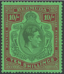
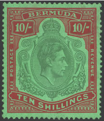
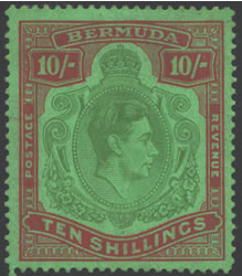
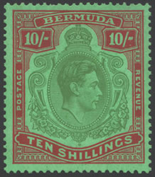
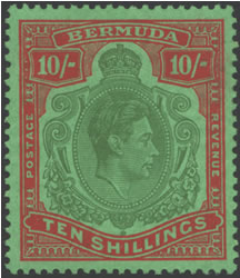
CW 14, SG 119, ST 126a
Green & Deep Lake
Bright Green Chalk Paper
Comb Perf 14 x 13.75
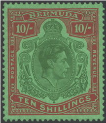
CW 14A, SG 119A, ST 126b
Blue-Green & Red
Light Green Chalk Paper
Comb Perf 14 x 13.75
CW 20, SG 119B, ST 126b
Dull Yellow-Green & Dull Carmine
Green Chalk Paper
Line Perf 14.25
CW 14A, SG 119A, ST 126b
Yellow-Green & Deep Red
Light Green Substitute Paper
Comb Perf 14 x 13.75
CW 14A, SG 119A, ST 126b
Deep Green & Brownish-Red
Light Green Substitute Paper
Comb Perf 14 x 13.75
CW 14A, SG 119A, ST 126b
Deep Green & Dull Red
Light Green Substitute Paper
Comb Perf 14 x 13.75
It is similar in color to the Perf 13 issues.
CW 24, SG 119E, ST 126
Deep Green & Vermilion
Light Green Substitute Paper
Comb Perf 13.25 x 13
CW 24A, SG 119F, ST 126
Deep Green & Dull Red
Light Green Substitute Paper
Comb Perf 13.25 x 13
Suggested steps in sorting these stamps. We assume you have a number of copies to compare, or this can be very difficult.
1. Measure the perforations. Separate into the Perf 13, 14, and if you
are lucky the line perf issues.
2. Among the Perf 14 issues:
a. Check for chalk or substitute paper. The chalk paper issues will tend
to have yellowish to brownish gum, the substitute paper issues will tend
to have clear gum.
b. Assuming you have eliminated the Line Perf, the remaining two chalk
paper issues can easily be sorted by comparing the head color. The 1937
printing has a very distinctive paper and frame color. The 1939 printing
has a more blue-green center, and is red rather than the purplish-red
(lake) color of the 1937 printing.
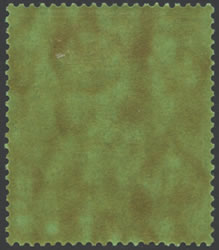
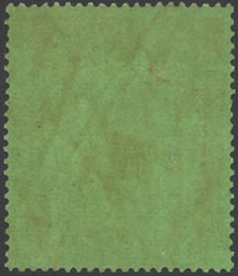
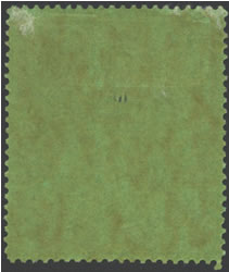
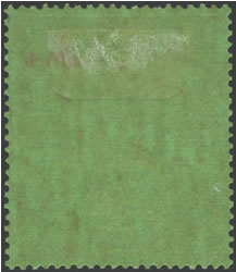
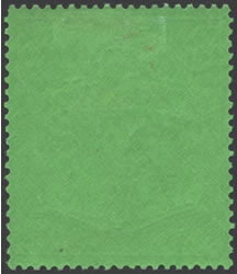
c. Regarding the substitute paper issues, the next step is to look at
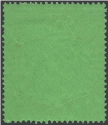
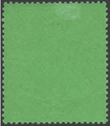
the backs. Isolate the emerald paper back of the 1946 printing. This is
very much like both of the Perf 13 printings and is easily recognized.
d. The remaining two Perf 14 issues will be on substitute paper with brownish
gum. Look at the head colors to make your decision. The 1943 printing
is lighter in color than the 1944 printing. You should also note a difference
in the frame colors between the deeper red and the brownish-red.
3. Among the Perf 13 issues:
a. Both issues will have substitute paper. The most telling difference
is the vermilion frame in the 1951 printing. It is bright and fairly easily
noticed. It should not look like any of the other printings.
KGVI NH - KGVI Unused - KGVI Used