SUIDAFRIKA with no Hyphen
Updated - June, 2020
The South Africa King George V era pictorial issues were
printed beginning in 1926. They are some of the most confusing stamps
in the British Colonies to properly sort. It is the goal of this article
to help you to identify the basic issues as described in the Stanley Gibbons
and Scott catalogs. There are additional color and perforation varieties
to this issue. They have been left out in order to simplify the sorting
process. Please see the South African Stamp Color Catalogue for additional
details on these stamps.
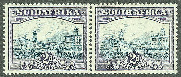
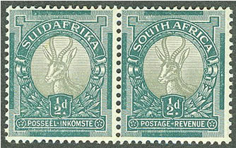
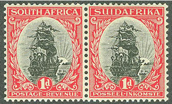
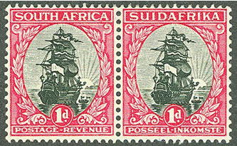
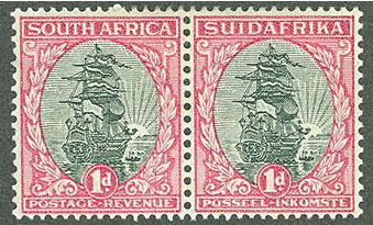
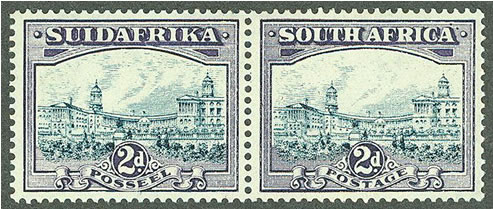
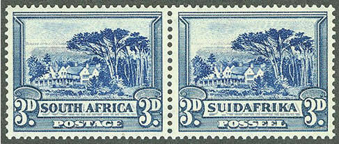
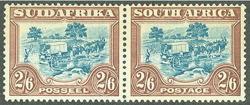
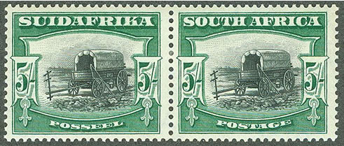
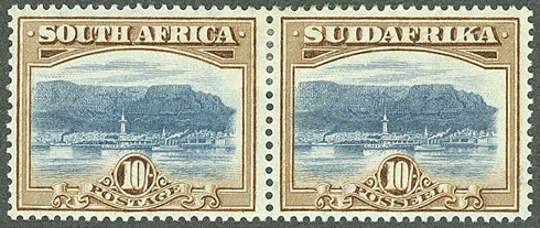
There are two sizes of stamps; the 1/2d, 1d, and 6d values which were
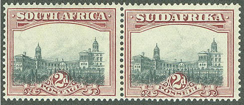
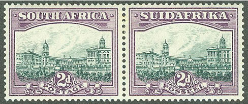
printed in a smaller size and the remaining values which were produced
in a larger sized format. All stamps were printed in se-tenant pairs using
two languages - English and Afrikaans. They are typically collected in
horizontal pairs.
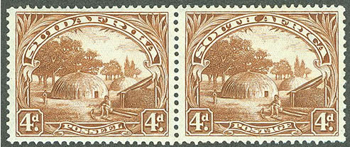
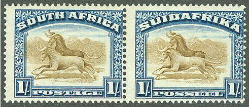
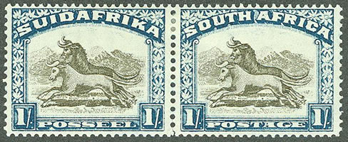
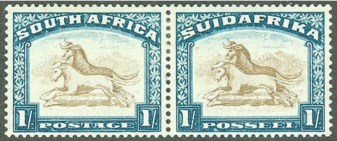
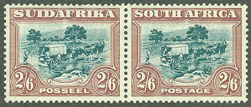
The smaller sized stamps were initially printed using Typography by Waterlow, and then by the South African Government printer in Pretoria in 1927 using the same plates. In 1930, new plates were created for these stamps with subtle changes. The stamps were printed in Pretoria using a Rotogravure process. The larger sized stamps were initially Recess printed by Bradbury, Wilkinson in London. This method yields a better quality impression. In 1930 new plates were created and the stamps were printed using Rotogravure in Pretoria. This method results in a coarser impression. Sorting the stamps is done by determining the difference between the two printing methods and the characteristics of the design changes.
The catalog numbers are from the 2011 Stanley Gibbons Stamp Catalogue (SG) and the 2011 Scott catalog (ST).
The images were saved in a larger size and at a higher resolution so you can more easily see the details used in sorting them. They are arranged on top of each other to allow comparison between the printings. Please be patient if it takes a few minutes for this page to load.
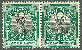
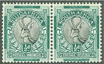
The leg is longer and more curved in the London Printing, and shorter and straighter in the Rotogravure Printing.
The The leg is longer and more curved in the Typography Printing, and shorter and straighter in the Rotogravure Printing.
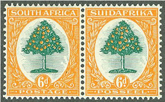
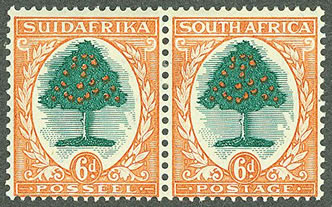
The The leg is longer and more curved in the Typography Printing, and shorter and straighter in the Rotogravure Printing.
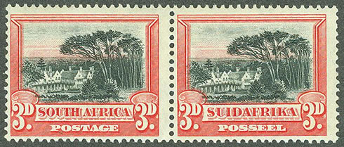
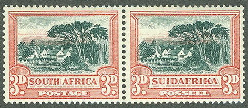
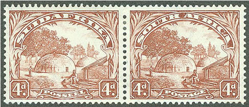
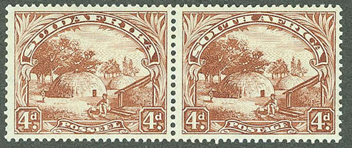
You will find a number of shades ranging from light brown to a deeper brown for this printing.
They are very well defined with more detail in the Recess Printing, and less defined in the Rotogravure Printing.
You should also notice how well defined the frame around SUIDAFRIKA and SOUTH AFRICA are in the Recess Printing
compared to the Rotogravure Printing.
than what you will see in the Rotogravure Printings.
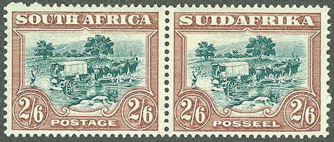
The Scott catalog lists the green shades as Brown & Slate-Green, Chocolate & Deep Green and Red-Brown & Green
This article was written to help you identify your stamps. Please feel free to ask a question, or include a correction.