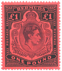
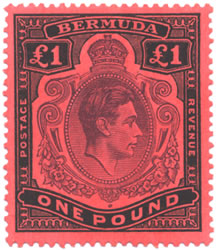
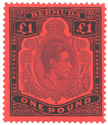
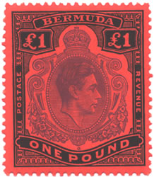
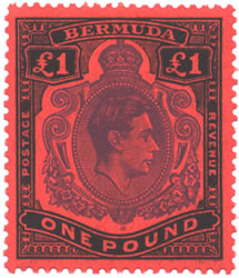
King George VI Stamps
Identifying the Bermuda One Pound King George VI stamps is a matter of comparing these components:
1. Perforation - there are two options - Perf 13 and 14. There was no
line perf issue for this denomination.
2. Paper Coating - Chalk or Ordinary (called Substitute). In the case
of the Pound values, they are all on chalk paper, so you do not need to
check this aspect.
3. Color - the variation in the center (head) color and frame colors helps
determine some of the printings. Please be aware that there is a range
to the colors on individual issues, so don't expect them to match exactly.
Also, a computer monitor is not considered an accurate method of reproduction.
So you may not see the colors accurately. I generally use a piece of black
paper under two spotlights to compare my colors. The black seems to help
most colors stand out better.
Please see our StampID page for additional details on using some of the tools described above.
The dispatch dates and color descriptions are per "The King George
VI Large Key Type Revenue and Postage High Value Stamps 1937 - 1953"
by Eric Yendall. This is a must
for any Bermuda Keyplate Collectors. See your dealer for a copy.
The catalog numbers are from the 2008 versions of the Commonwealth
(CW) Catalogue, and the Stanley
Gibbons (SG) Catalogue. and the Scott (ST) Catalog. Please be aware
that Gibbons does not list all the dispatches, so we have to make some
debatable conclusions when assigning their numbers to some of these printings.
The basic Scott Catalog only lists the two perforation options.
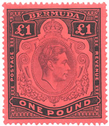
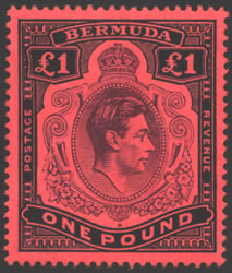
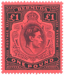
CW 16, SG 121, ST 128a
Pale Red-Purple & Black
Red Chalk Paper
Perf 14 x 13.75
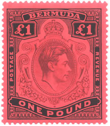
CW 16A, SG 121B, ST 128b
Pale Purple & Black
Salmon Chalk Paper
Perf 14 x 13.75
CW 16B, SG 121C, ST 128b
Purple & Black
Salmon Chalk Paper
Perf 14 x 13.75
CW 16C, SG 121C, ST 128b
Deep Purple & Jet Black
Salmon Chalk Paper
Perf 14 x 13.75
Looking at the salmon paper issues of 1941, 1943 and 1945, the head color on this printing falls between the other two. The 1943 printing has a muddy look to the head plate. This is best seen under a glass looking to the right of the King's head. You should notice that the lines of the design do not come all the way back to the head. It is almost like the ink smeared in that area.
CW 16D, SG 121C, ST 128b
Bluish-Purple & Black
Salmon Chalk Paper
Perf 14 x 13.75
CW 26, SG 121D, ST 128
Pale Violet & Black
Bright Red Chalk Paper
Perf 13.25 x 13
from the other Perf 13 issues.
CW 26, SG 121D, ST 128
Violet & Black
Bright Red Chalk Paper
Perf 13.25 x 13
CW 26A, SG 121E, ST 128
Bright Violet & Black
Bright Red Chalk Paper
Perf 13.25 x 13
from the other Perf 13 issues.
Suggested steps in sorting these stamps. We assume you have a number of copies to compare, or this can be very difficult.
1. Measure the perforations. There are only Perf 13 and 14 options.
2. All paper is chalk paper, so this is not necessary. The paper was left
over from the early KGV days, and as a result the watermark is MCA rather
than MSCA. It is believed that the coating caused the paper colors to
change since they were all from the same batch.
3 . Sort the Perf 14 stamps by paper color so that you isolate the 1937
printing. After that use the head color to determine the other four printings.
4 . The Perf 13 printings are also sorted by head color. The light one
is 1951, a very deep one is October, 1952, and the other one is the April,
1952 printing.
KGVI NH - KGVI Unused - KGVI Used